Showing posts with label Development. Show all posts

Thursday, 6 December 2012

White Canvas Scene

And another quick update to let you see how the 'unaffected' scenery is coming along. That is the blank canvas. Llogari has been playing around with the lighting and come up with this intense lighting that creates some awesome shadows. We plan to have another light that is just on the characters to stop them disappearing in the shadows altogether. Here are a few snapshots of the first scene to be animated to show the lighting. It is the valley scene.


And one last picture, a close-up of Carl's eyes...


Textures Complete

A quick update on the studios progress. With the completion of our character rigs the studio has been busying themselves with animating and lighting. Unfortunately we were victim to the delightfully buggy Maya 2013.5 extension meaning 10 seconds of animation is only accessible at uni but we have persevered.
We also now have all the texture maps completed with two versions of the environmental maps so that the scenery can change accordingly as the characters interact with it. As planned the textured were painted and sketched by hand and scanned back onto the computer to create as realistic effect as possible.
Textures

Friday, 19 October 2012

Orthograph

Character Creation is underway with the completion of our orthographs. I started off drawing by hand and using a ruler to make sure every element was as identical as possible.

Then I scanned it in to work with it on Photoshop to create a nice crisp edge for modelling.

Simon
 

Carl - there are three versions of carl. Each have a different variation on the cape. The cape will be a separate element to our model as we're not sure how well it will animate so we're leaving the possibility of detaching it from the model altogether.


Thursday, 11 October 2012

Character and Environment Concepts


Having finalised the script and storyboard as much as we can at this stage (before a pre-viz) we began to look at refining our two characters and the setting.

Character

As concept artist I was challenged to create two boys that had the same features and shape but differ in personality. The reason we decided to have the boys look identical is an extension of the Prince and the Pauper, the story that inspired our narrative. It works best for our story as the idea is that the boys are exactly the same except that one embodies religion and the other science. They are parallels of the same person. This helps us show metaphorically through our narrative that the two opposites, Religion and Science, leave massive imprints behind them (in history) and combined together they form a functioning world.


Getting a Face

We knew that we wanted a cartoonish style. In a studio discussion we decided which level of cartoon we wanted. This is a scale ranging from ‘Phineas and Ferb’ to ‘Polar Express’. We settled on somewhere in the middle.


I drew up some faces and tried variations to give the studio a variety of options. We agreed that number 1 with eye shape b would work best for our characters as it is sweet and would make them both instantly appealing.


Getting the Shape

Using the basic face shape I experimented with different body shapes. We wanted out boys to be young teenagers so their beliefs aren't attributed to naivety. I began with a long body with exaggerated features then tried different variant on this. To make sure there was a variety of a choice for the studio to pick from I created a shorter character option too. We decided that shape 1 worked the best with the action genre of our story. It would show the movement of the boys clearly with exaggeration on the feet that will leave an imprint behind.


Getting the Costumes

After a trip to the library to find costumer books on renaissance fashion we walked away with a lot to sift through. We looked at religious figures like the pope to see the style of dress they wore and at the ‘current’ fashion of the era. We wanted to represent the differences of the boys visually through their clothing. The trick was to make it so the audience, assuming they don’t have a prior understanding of renaissance fashion, could read the beliefs of the characters through appearance. We found that clocks and loose, draped fabric with simple patterns was often worn by the religious figures. Tight, shapely and elaborate clothing was worn by young fashionably men. Fashion works in representing science as fashion is all about the new, the re-design and what’s next.

Here are the most influential images from our book research.


I quickly sketched out some rough ideas for each characters costume.

Then combined the whole lot together; face, body and costume. The next stage is to colour the two in to match their art style (da Vinci – Simon, Michelangelo – Carl) and create the image planes so we can begin to model the characters.


Environment Concept

The style of our environment will be a cartoonistic style that works best with our characters. Not overly detailed but not abstract. The textures will be fairly basic but still reflect the real life object it represents. The following concept art looks at the colour palette and the hot and hazy effect we want in the first scene when they characters find themselves stranded. 

Friday, 5 October 2012

First Draft StoryBoard


Here is own first rough storyboard. Just starting to look at how to move the camera and how we want to show our story. After a meeting with Alan about adding extra action and tension to our story we discovered we could do this by adding ‘action shots’ to show the characters fast movements from closer up. We are now starting work on a more refined storyboard to use for an animatic.


Tuesday, 2 October 2012

Scriptwriting: Second Draft Script


Over the weekend each studio member wrote their own version of the story we had discussed and settled on. We found we had written much the same script with only marginal differences. We also felt that the ending lacked that extra tension; there was no danger pushing them ahead. After testing out a few ideas verbally we decided that using the ‘ticking bomb’ technique would work best. We don’t intend on blowing up our two boys, but have the sun sinking in the corner like a counter going down, suggesting that the boys need to reach their goal before the sun sets. We’ll also use music to increase the tension i.e. faster paced when building to a climax and the music suddenly starting to suggest a chase/sudden action. Using incidental music, the ‘ticking bomb’ and other elements of our story, such as the opposite character types, will help our audience follow our story as they aid the narrative.

This is the second draft of the script with the addition ideas included.

Monday, 1 October 2012

Testing Concepts


Latest at the studio is working on our design concept for the characters. Here we have been testing to see how effective our idea for the contrasting styles will work. This isn't our final character design, just a quick character outline to test the designs on.

The scientist character will look like a da Vinci drawing while the religious character will look like the painted masterpieces of Michelangelo.

We discussed these designs earlier today and decided the best way to achieve the desired effects would be to hand paint and sketch the texture maps physically then scan them in to be wrapped around the models. This means we the textures will look more natural and effective as opposed to trying to recreate the effects using Photoshop, which will always look synthetic. 


Friday, 28 September 2012

Developing the Story: The Message

The Message
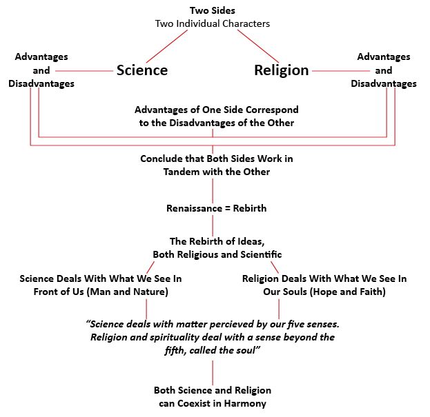
The Renaissance was a period of discovery and rebirth, specifically, the rebirth of culture. A significant aspect of this period of rebirth were the changes in attitude towards science and religion. 
The two topics are often considered polar opposites, with science typically being used to find fault in the teachings of religion, although it has also been said that science and religion can coexist, contributing to Mankind in different, but completely valid, ways.
The diagram above explains that in regards to the existence of Man, both science and religion have merit. It is this idea of harmony between the two sides that we will be addressing in our animation. 

The Basic Plot
Two characters represent Science and Religion as separate entities. The two characters awake to find themselves stranded on an island after the ship they were travelling on capsizes. At first, the characters are weary of one another, considering their hugely contrasting backgrounds, but they soon realise that in order to reach the other survivors on the island, they will have to put their differences aside and work together. For example, the characters reach a body of water that they cannot cross. The scientific character constructs a boat in order to cross the water, but without any wind, they won't be going anywhere. The religious character puts their faith and spirituality to good use, asking a greater power for the gust of wind that they desperately need to get moving. Without the scientific character's knowledge of carpentry and buoyancy, the religious character would be stranded, but that knowledge is useless without the religious character's connection with spirituality.